Brand
Black, off-white, and one red ink for the stamps. Hierarchy comes from tone and weight. The only shape that is not a letter is the coin.
Wordmark and mark
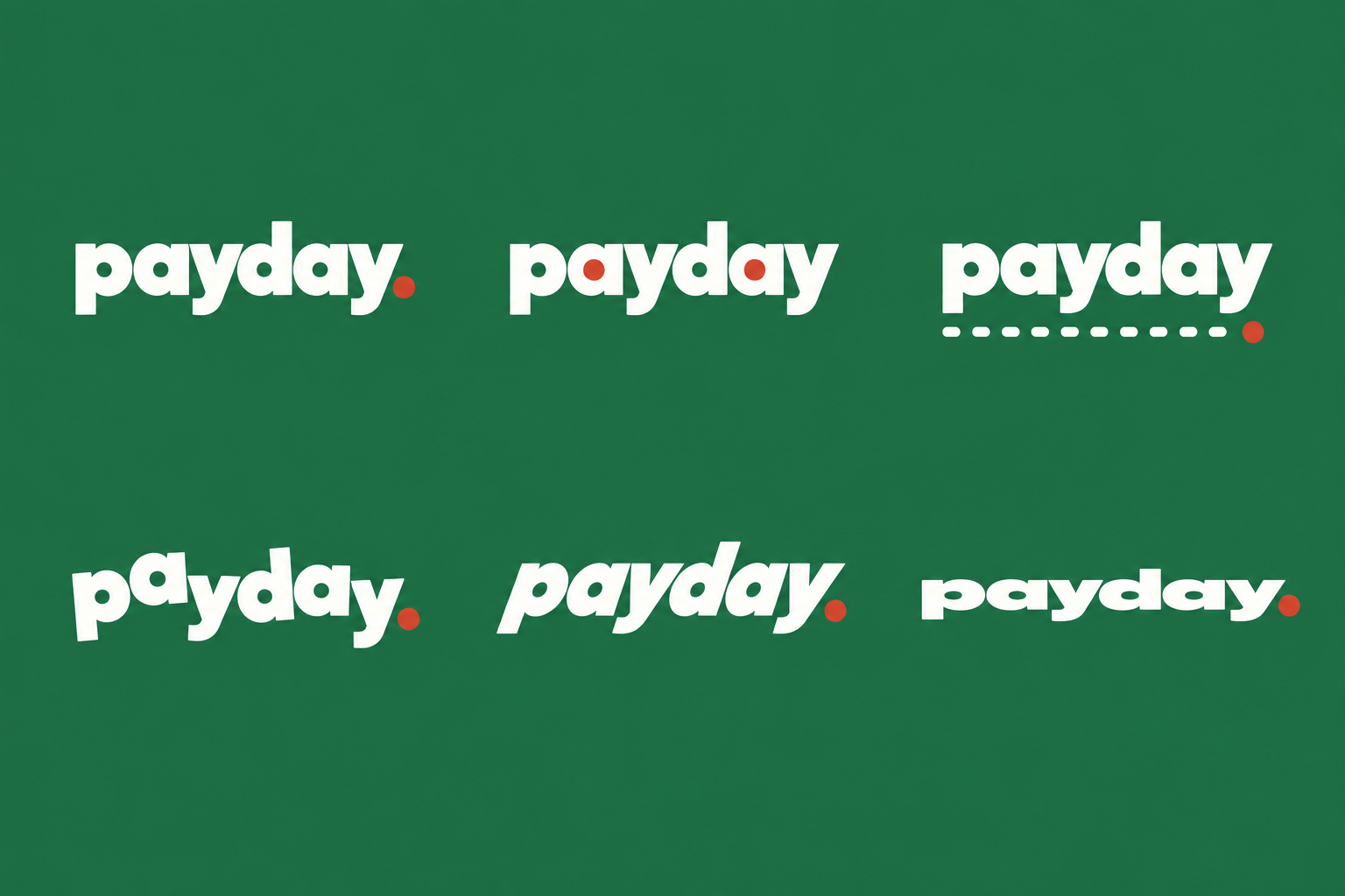
The wordmark is lowercase, heavy, and tight, ending in a full stop. The mark is a coin seen just off face-on, its reeded edge showing on the right: it reads as the O in owed. They are never shown side by side; the wordmark is for headers and the coin is for icons, avatars, and the token image. Never letterspace the word, never put either on a gradient, never recolor them.
Color
Seven greys between black and off-white. The right column is the reverse for light surfaces only. Red is the stamp ink, and errors. Nothing else.
Type
One family, Outfit. Geometric with a single-storey a. Headlines at 800 and tight; body at 400. Every number is tabular so columns of money line up. No monospace, no all-caps labels.
Coins on Owed launch on pump.fun with half of every creator fee owed to a named X handle and half to the pool. Each Friday the pool is swapped to USDC and settled with holders, in proportion to what they hold.
Voice
How Owed talks, on the site and on X.
“$4,210.55 settled with 1,402 holders of $DEPOSIT. Receipts on the coin page.”
“Settles in 2 days. 37.8 SOL owed.”
“The internet owes @handle 10.7 SOL. Somebody tell them.”
“Kept by Owed: 0%.”
“Revolutionary DeFi yield protocol.”
“WAGMI. 🚀🚀🚀”
“Passive income.” It is fees, and fees can be zero.
Anything that sounds like a promise. Post numbers, not adjectives.
Assets
Rendered live from the brand tokens, so they never drift from the site. Open one and save it.
The coin
How $OWED is written and launched.
Source concepts
The generated options the marks were rebuilt from.